Thursday, 26 November 2015

Book Cover (Photoshop)

For this book cover first I divided each section with ruler lines. As a background I found a dark image of a car in a foster and I put it behind everything. For the front page I wrote the book title in a large font with the name of the author at the bottom a bit smaller than the title but still a bit large to gain the attention. In between I inserted two images which I gave them a circle shape by using the Elliptical Marquee Tool. Also I made them black and white and decreased their opacity. For the flip of the back (author section) I inserted an image of the author and made a clip mask of a circle shape so the image take the same shape. Then at the back I added a stroke for the bar code because it was black on a dark background and it wasn’t that visible, so thanks to the stroke the bar code came visible. For the same reason I made the dummy text in a white colour.


Flyer (Photoshop)

For this flyer I decided to keep a plain background with two rectangles across each other to make that kind of movement effect in the background. The title which is “Stress Management Seminar” I made it with capital letters to gain attention, with a colour and with a shadow effect. Across it I wrote “Open to all MCAST Students” with the same colour as the boxes and again I gave the shadow effect. Below this I put an image related to stress so the flyer won’t be text only. At the bottom of the flyer I wrote the details; date, time and place with a different colour. Then in the up-right corner I put the MCAST logo to sort of proof that it is supported by the collage.


Wednesday, 25 November 2015

Grid Project (Illustrator)

For this exercise we had to divide an 8 by 8 inch art-board into four columns and rows with ¼ of an inch between each section. We had a set of text that we had to arrange them through the whole grid, by making an effect with the whole text, but still being readable with a font size 8 and with a font type from Switzerland. We had to make three different with the third one we could add another font size. To make the certain effects basically I used the left, right and centre alignment, arranging the text box size to make it continue in another part, by dragging the small red cross.


Recipe Booklet (Illustrator)

For this exercise I did two art boards in the same document and made a ruler margin in the middle of each so I will know which page that specific part will be, as the recipe is a small booklet.


First I gave a sort of a yellow colour to the background, then I started with the front page; putting an image of the main ingredient (in this case the bacon), in the middle of the page with “Bacon” written above it and “Recipes” written below it, both in capital letters and in black colour. To make a sort of effect to the front page I put two lines in the top left-corner and in the bottom right-corner, and gave them an orange colour to be in the same scale of yellow. After that I started with the pages of the inside (the actual recipes). Basically for both of them I put their title on top of the page in bold and in black colour, then underneath that I mentioned the “Time”, “Ingredients”, and “Directions” with the titles being bold, and all the text in black colour. In the bottom right-corner of each recipe I put an image of a final product.


Drawing (Illustrator)

For this exercise we were divided into groups of three and each individual had to draw on an A4 paper folded in three so the others won’t be visible to the other group members. Basically the drawing had a head, body, and legs.

Hand Drawing

After it was drawn by hand we had to scan it and make a digital version of it by Illustrator. I did this by going through the lines of the picture by the pencil tool and here is the result:

Digital Drawing

Face Illustration (Illustrator)

For this illustration I searched for some portraits and I chose a portrait of Vladimir Putin.


First I opened the image on Photoshop to select certain areas and make paths for them. To select these parts I chose different tools between Quick Selection, Magic Wand, and also the Magnetic Lasso Tool. For every part I selected I created a path for it, and after I selected the parts that I wanted I exported them to Illustrator. From here I started to given each path (selection) a colour and for every path I had that in the real picture was darken with a shadow, I gave a darker colour to make a bit of a contrast.

Here is the result:


Weekend Break Advert (Illustrator)

For these adverts I found an image from the internet and put it in Photoshop to make it black and white for the first advert which had to have only black and red as colours. After that I moved it to the Illustrator where I put it in the middle of the composition. Then I started the text which basically I've put the ‘Weekend Break Special’ above the image with a red colour fill, while the hotel name, telephone number and website below the image with a black colour fill.


Then for the colour advert I inserted the image in Illustrator and placed it slightly above the middle of the composition. After that, I put the name of the resort above the image with a yellow colour fill and a black stroke, while the ‘Weekend Break Special’ below the image together with the telephone number and website, and for the information I chose the same colours as the name of the resort, while for the slogan I chose an orange colour fill with a black stroke.


Name Logo (Illustrator)

To make this logo I used really simple and basic steps, starting with by writing the letter ‘M’ and the letter ‘E’ in capital and enlarged them a bit. After that I've put them towards each other so they get the look as they are on thing. Then I wrote the word ‘Enrico’ and ‘Manicaro’ separately and placed them in the space of the letter ‘E’ has. Finally I've put a circle behind the letter ‘M’ so it won’t be a text only logo. I made this logo in three different colours, starting with; achromatic, complimentary and monochrome.


Friday, 6 November 2015

Texture within Text (Photoshop)

For this exercise I decided to choose the word Water and give it the wavy type.


I first wrote the word in a Plain Font Type, and after that I chose an image from the internet of water and I inserted it in Photoshop.

Then I put the image above the text and made a Clip Mask for it and like this the word took the image as its fill.

Finally I chose the Smudge Tool and started to go over the word to have the sort of wavy effect as you can see in the image.


Monday, 2 November 2015

Collage Dark vs Light (Photoshop)

Dark vs Light Collage

To do this collage I took the perspective of light and dark in a way of good moments for the light and bad moments for the dark, in lifetime episodes.
I started with the background image by choosing two images which describe light and dark in the perspective that I decided to do my collage on. I wanted to have one image from both, which will be divided across from corner to corner. To do so I used the Pen Tool; I created three points covering a corner of the image and then went across half of the image. After this I right clicked on the selected part and clicked on Create Vector Mask so the image will remove the other half and keeps the part I covered with the pen tool. I repeated the same thing to the other image and after I combined them together, I merged the layers together to become as a one image.

When the background image was ready I chose two different fonts in a way that they contrast with the actual word. I chose the Rage Italic font type for the Light because it is a handwritten type it creates certain flow in the wording, while for the dark I chose the Narkisim font type because it is a solid and a bit bold which make a good contrast for the wording.

After this, I started inputting the images. For the light side images I used the Magic Wand Tool and the Quick Selection Tool to remove the background of certain images. I used the Lasso Tool to cut a part of an image, and also for the same reason I have chosen the Elliptical Marquee Tool to cut the image in a shape type. For the dark side images I used the Eraser Tool in a way to fade the edges of the images and I made an image Black and White as it was in colour to keep the side on the dark.

Divider

Task 1 Finished

Task 2 Starting

Wednesday, 21 October 2015

Colour Harmony

This is when two or more colours makes sense when putting together. This means that when you see them you will notice that they sort of clash together.

There are different types of colour harmonies:

Monochromatic: is the different values of a colour (tints, shades).

Monochromatic


Analogous: three or more colours that are found side by side on a colour wheel.

Analogous


Complementary (Direct Complementary): those colours which are opposite to each other on a colour wheel.

Complementary


Split-complementary: a colour together with those colours which are on both sides of its complementary.

Split-Complementry


Double complement: two sets of complementary colours next to each other.

Double Complement


Tetrad: up to four colours that have an equal distance from each other.

Tetrad


Diad: two colours that skips the colour between them on a colour wheel.

Diad


Triad: three colours which have the same space between them on a colour wheel.

Triad

Reference:

Fundamentals of Colours

These fundamentals of colours are the way a colour is described/how it is made.

Hue: this is the actual colour.

Hue


Saturation: this is the addition of grey to the hue (colour). The less saturation there is the more grey the colour will have and therefore it will look dull. If the saturation is set on the higher side the more purely the colour will be.

Saturation


Brightness: this is how much bright or dark the colour will look like. To look bright a hue needs to have white added to it, while to look dark needs to have black added to it.


Brightness


The more changes there will be in these fundamentals the more the colour will change in its appearing way.

Reference:

ICC Profiles

ICC is the abbreviation of International Colour Consortium. These profiles usage is to display the proper colours of a file. Basically it is the colour ID of a device.

An ICC profile will keep information such as how many colours the device can display and if the colours are provided in the way they should be. These profiles are obtained after a calibration of the device is done. 

ICC Profiles

 If the device used is not calibrated, therefore it doesn't have its own ICC Profile, the colour values are going to be different then they are supposed to be. But if the device is calibrated thanks to the ICC profile that would be created, the colour values will be the same as it is supposed.

Calibration vs Non Calibration


Reference:

RGB and CMYK

There are to groups of colours and these are the RGB and CMYK.

RGB (red, green and blue), is the colour space monitors uses. It starts with black (darkness) and after it adds all the colours mentioned, it finishes with white. Every colour project itself to be visible.

RGB


CMYK (cyan, magenta, yellow, and black), is the colour space printers uses. To the opposite of the RGB, this colour space starts with white (the paper) and if all the colours are used it will finishes with black.

CMYK

Reference:

Tuesday, 20 October 2015

Pixel Value

Basically this is the brightness of a pixel in an image, and shows the exact colour it is. This is stored in an 8-bit integer with a range from 0 to 255 of possible values. The 0 is mostly used to represent the black colour while the 255 is used to represent the white colour.

Grayscale pixel value

This is how the pixel value of a grayscale image is known, and for a coloured image the red, green and blue are separated like the grayscale image and this is known as colour planes.


The actual intensity of a colour can be found in a colour-map, where every information stored for each pixel of a grayscale or colour is an index to it because the intensity of them may not be stored accurately.

Colour Map

Reference:


Colour Depth

This is the number of bits per pixel on a monitor to represent a colour. The more bits per pixel a monitor has the more variety of colour it can show. This will affect even the quality of the monitor, because the more colours it can show the higher the quality it would be.
Thanks to the evolution of the technology, the colour depth improved a lot. It went from 1-bit to 48-bit.

Bit Colour Difference


Different colour depths:

1-bit shows 2 colours, Monochrome display.
2-bit shows 4 colours, CGA display.
4-bit shows 16 colours, EGA display.
8-bit shows 256 colours, VGA display.
16-bit shows 65,536 colours, XGA display.
32-bit shows 4,294,967,296 colours
48-bit shows 281,474,976,710,656 colours


Reference:


With what a colour is associated?

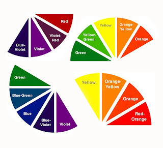
Where ever we are and where ever we look, all we see is coloured, or has its own colour by nature. We associate colours with religious, culture, politics and also it can affect our mood; it is a way of communication.

RED: This colour is associated with love, passion, desire, danger, energy, determination, strength, war and power. It is very visible, which is why it is used to indicate danger, and also used in most of the road signs; such as the stop sign or the one way. This colour raises blood pressure, increases respiration rate, and also the human metabolism.

No Entry (One Way) Sign


YELLOW: This colour is associated with intellect, happiness, energy, joy, food, cowardice, children, and leisure. It is an attention getter and it is mostly used in warning signs (with a combination of black) and also for taxi cars. This colour is very cheerful, it generates muscle energy and it also stimulates mental activity.

Taxi Cab


BLUE: This colour is associated with males, depth, stability, faith, intelligence, heaven, confidence, truth, loyalty, trust and wisdom. Because it’s the colour of the sky and sea, it is mostly used to promote things/services that has something to do with them, such as mineral water, and airlines. This colour produces a calming effect, and it slows the human metabolism.

Sky and Sea


ORANGE: This colour is associated with happiness, determination, success, creativity, enthusiasm, stimulation, fascination, encouragement, attraction, healthy food, strength and endurance. It is a very hot colour for the eye of human therefore it gives sensation of heat, it stimulates mental activity, produces an invigorating effect and it increases oxygen supply to the brain.

Fire


GREEN: This colour is associated with freshness, nature, harmony, fertility, safety, growth and money. For the human eye this is the most restful colour, and it can also improve vision. It is mostly used to promote green products such as vegetables because of its relation with nature.

Vegetables


PURPLE: This colour is associated with females, royalty, luxury, power, ambition, nobility, wisdom, independence, magic, creativity, mystery and dignity. It is a very rare colour in nature when considering the other colours.

Purple Female Figure


WHITE: This colour is associated with innocence, faith, goodness, light, purity, virginity, and medical staff. It is considered as the colour of perfection and it is usually used to promote medical products. It is also seen as positive.

Medical Staff


BLACK: This colour is associated with elegance, death, mystery, power, evil, formality, and fear. It is mostly used as a background for the other colours, especially for the bright colours, as these will make a good contrast. When you wear a black dress or suit it is very likely to look thinner. It is mostly used when someone pass away because of its association with death.

The Death


Reference:
                                 

Pantone

This is a standardized colour matching system. It is like the book of colours, where every kind of colour is in it and is also numbered to be identified.

Pantone Palette

Thanks to it a colour can be chosen and will be used for both designing and printing. After the colour is chosen by the client and the designer, the artwork will be designed and after everything will be ready it will be ready for printing, so the designer will give the printing company the reference number of that specific colour so it will match the exact colour that was chosen in the beginning.

There are more than one type of pantone palettes, such as;
Process Palette done by CMYK printing.

Textile Palette for Fashion and Home colours.

Plastics Palette used by manufacturers for moulded and fabricated plastics.

But the most common palette used by designers and the one mentioned before is the Solid Palette.

This palette will section every colour by a three or four digit numbers, followed by a C (Coated Paper), U (Uncoated Paper) or M (Matte Paper). Example: Pantone 286C, and that will result in the colour blue, shown below.

Saturday, 17 October 2015

Colour Contrast

When you put colours together you can notice that an effect will be done and that every colour has its own characteristics. This is what colour contrast is; the link between colours, and the following are different types of contrasts.

Complementary Contrast: Every colour has its own complementary colour and this is the colour facing it in the colour wheel. This contrast happens when these colours are combined.

Complementary Contrast

Simultaneous Contrast: This contrast happens when a colour is placed with another colour which is not its complementary.

Simultaneous Contrast

Quality Contrast: This contrast happens when a colour is linked with another version of it, such version would be brighter or dull.

Quality Contrast


Quantity Contrast: This contrast happens when different sized colours are related to each other.

Quantity Contrast

Cool-Warm Contrast: This contrast happens with the combination of warm colours with cool colours.

Cool-Warm Contrast

Friday, 16 October 2015

How Colours are made?

The main colours that thanks to them we can have all the other colours are called the Primary Colours. These colours are; Red, Blue and Yellow. When we mix one of these colours with another we will have other colours. These colours are called the Secondary Colours and from this, the Green, Purple, and Orange start to appear. When you mix a primary colour with a secondary colour you will add up with a tertiary colour. This can be understood better on a Colour Wheel.

Primary, Secondary and Tertiary Colours


The colours on a colour wheel are divided into two categories, the warm colours and the cool colours.

Warm and Cool Colours

Apart from that, colours has Tints and Shades. Tints are those colours that are mixed with white, therefore the colour become lighter. While the Shades are those colours that are mixed with black, therefore the colour become darker.


Tints and Shades Colour