Wednesday, 25 November 2015

Name Logo (Illustrator)

To make this logo I used really simple and basic steps, starting with by writing the letter ‘M’ and the letter ‘E’ in capital and enlarged them a bit. After that I've put them towards each other so they get the look as they are on thing. Then I wrote the word ‘Enrico’ and ‘Manicaro’ separately and placed them in the space of the letter ‘E’ has. Finally I've put a circle behind the letter ‘M’ so it won’t be a text only logo. I made this logo in three different colours, starting with; achromatic, complimentary and monochrome.


Friday, 6 November 2015

Texture within Text (Photoshop)

For this exercise I decided to choose the word Water and give it the wavy type.


I first wrote the word in a Plain Font Type, and after that I chose an image from the internet of water and I inserted it in Photoshop.

Then I put the image above the text and made a Clip Mask for it and like this the word took the image as its fill.

Finally I chose the Smudge Tool and started to go over the word to have the sort of wavy effect as you can see in the image.


Monday, 2 November 2015

Collage Dark vs Light (Photoshop)

Dark vs Light Collage

To do this collage I took the perspective of light and dark in a way of good moments for the light and bad moments for the dark, in lifetime episodes.
I started with the background image by choosing two images which describe light and dark in the perspective that I decided to do my collage on. I wanted to have one image from both, which will be divided across from corner to corner. To do so I used the Pen Tool; I created three points covering a corner of the image and then went across half of the image. After this I right clicked on the selected part and clicked on Create Vector Mask so the image will remove the other half and keeps the part I covered with the pen tool. I repeated the same thing to the other image and after I combined them together, I merged the layers together to become as a one image.

When the background image was ready I chose two different fonts in a way that they contrast with the actual word. I chose the Rage Italic font type for the Light because it is a handwritten type it creates certain flow in the wording, while for the dark I chose the Narkisim font type because it is a solid and a bit bold which make a good contrast for the wording.

After this, I started inputting the images. For the light side images I used the Magic Wand Tool and the Quick Selection Tool to remove the background of certain images. I used the Lasso Tool to cut a part of an image, and also for the same reason I have chosen the Elliptical Marquee Tool to cut the image in a shape type. For the dark side images I used the Eraser Tool in a way to fade the edges of the images and I made an image Black and White as it was in colour to keep the side on the dark.

Divider

Task 1 Finished

Task 2 Starting

Wednesday, 21 October 2015

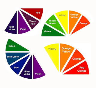
Colour Harmony

This is when two or more colours makes sense when putting together. This means that when you see them you will notice that they sort of clash together.

There are different types of colour harmonies:

Monochromatic: is the different values of a colour (tints, shades).

Monochromatic


Analogous: three or more colours that are found side by side on a colour wheel.

Analogous


Complementary (Direct Complementary): those colours which are opposite to each other on a colour wheel.

Complementary


Split-complementary: a colour together with those colours which are on both sides of its complementary.

Split-Complementry


Double complement: two sets of complementary colours next to each other.

Double Complement


Tetrad: up to four colours that have an equal distance from each other.

Tetrad


Diad: two colours that skips the colour between them on a colour wheel.

Diad


Triad: three colours which have the same space between them on a colour wheel.

Triad

Reference:

Fundamentals of Colours

These fundamentals of colours are the way a colour is described/how it is made.

Hue: this is the actual colour.

Hue


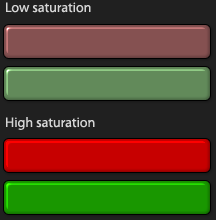
Saturation: this is the addition of grey to the hue (colour). The less saturation there is the more grey the colour will have and therefore it will look dull. If the saturation is set on the higher side the more purely the colour will be.

Saturation


Brightness: this is how much bright or dark the colour will look like. To look bright a hue needs to have white added to it, while to look dark needs to have black added to it.


Brightness


The more changes there will be in these fundamentals the more the colour will change in its appearing way.

Reference:

ICC Profiles

ICC is the abbreviation of International Colour Consortium. These profiles usage is to display the proper colours of a file. Basically it is the colour ID of a device.

An ICC profile will keep information such as how many colours the device can display and if the colours are provided in the way they should be. These profiles are obtained after a calibration of the device is done. 

ICC Profiles

 If the device used is not calibrated, therefore it doesn't have its own ICC Profile, the colour values are going to be different then they are supposed to be. But if the device is calibrated thanks to the ICC profile that would be created, the colour values will be the same as it is supposed.

Calibration vs Non Calibration


Reference: